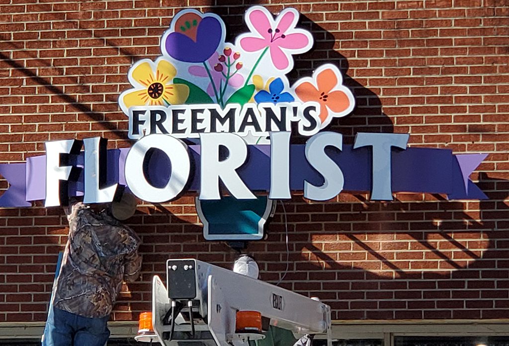
Jeff Freeman replaced his shop’s old, faded sign with a more colorful and three-dimensional sign, which caught the attention of new customers.
Editor’s note: This is a series to celebrate floral professionals’ ‘wins’ and inspire others with stories of innovations, problems solved, successful sales strategies and more. Have a win to share? Email SAF NOW’s managing editor, Amanda Jedlinsky.
Freeman’s Florist & Gifts has been operating from a brick building in the center of a Randleman, North Carolina for more than three decades. And during that time a sign outside let passersby know there was a florist in town.
Or did it?
“I was tired of people walking in and asking if I sell flowers,” says Jeff Freeman, who opened the shop at the age of 18 and has designed flowers for NASCAR drivers, Franklin and Billy Graham, and Bob Dole. “Even though we’ve been in the same location for 35 years, people still didn’t know we were here.”
And, his wife pointed out one day that the store’s beige, faded sign was the ugliest sign in town. Freeman interpreted that as permission to spend some money to upgrade.
The Win
Freeman had two new signs installed, earning the store instant attention. Suddenly the phone was ringing and passersby were stopping in thinking they’d found a new business. Even other florists were commenting on it, Freeman says.
“People were coming in asking, ‘When did ya’ll open?’ Others said, ‘When did you move?’” Freeman recalls. “That’s how I knew the new sign was actually working and creating business. It still brings in customers.”
The sign’s success also prompted him to adopt the imagery as the store’s logo.
The Gameplan
Freeman told the designer that he wanted bright colors that were eye-catching and wouldn’t easily fade (like red), and he also decided to put the emphasis on “florist” rather than on the store’s name or phone number. The result is a three dimensional, lit sign with flowers in a vase and the word “Florist” splashed across the front in big lettering.
“There is more to a sign than just a name and number,” Freeman says. “It is like floral design — you’ve got to make it stand out, it has to be creative — and then it catches people’s eye.”
He also went big. The new sign takes up about one-third of a wall on the building. And, he timed the installation to coincide with a town event, so there’d be lots of eyes on it.
The Takeaway
Two years later, the sign continues to draw new customers to the store, including a man who has attended church across the street for 12 years and never noticed the store.
And though it was an investment, it was well worth it. “It hasn’t paid for itself yet, but is it paying for itself, absolutely,” Freeman says. “Traditional marketing has not gone away.”
Amanda Jedlinsky is the managing editor of SAF NOW.


