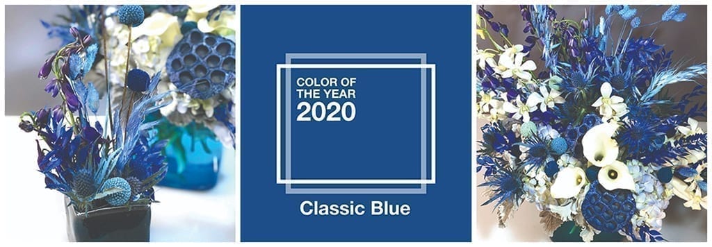
Understated yet also exotic, Classic Blue, the 2020 Pantone Color of the Year, offers boundless opportunities for florists to flaunt their creativity and show customers something unexpected. In Floral Management magazine, Kari Smith, AIFD, recently shared two floral design ideas that perfectly capture the best of the timeless color pick.
Smith, lead designer of Bouquets in Denver, said the indigo shade evoked the ocean and, more specifically, the “mysterious fathoms below”: mermaids, whimsical creatures that have trended for several years and will likely grow even more popular with the upcoming live remake of the 1989 Disney movie.
Smith paired natural blues — eryngium, delphinium and hydrangeas — with tinted craspedia (readily available from Florisol, an Ecuadorian farm), as well as white flowers and other dried materials she enhanced with Design Master color tool to “radically change the soft, neutral look into a mermaid-inspired design.”
The effect? Major depth and visual interest in the various examples of blue from periwinkle to turquoise to navy — gradations reminiscent of the sea (or a mermaid’s shimmery tail). “Painting adds a little time, but it’s well worth it,” Smith said of the added perceived value. She made this particular design for one of Bouquets’ standing orders and was able to remove all the dried materials when it returned a week later and resell them in another arrangement.
See more of the designs and get more information on how to construct them in the February 2020 issue of Floral Management.
Katie Hendrick Vincent is a senior contributing writer and editor for the Society of American Florists.