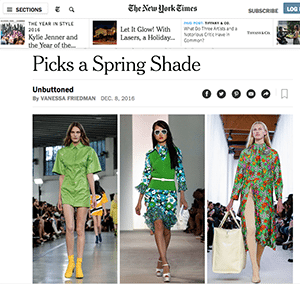
Pantone’s selection of Greenery (Pantone 15-0343) has been a hit among design industries, including fashion, home décor and florists.
Floral designers’ overwhelming response to Pantone’s Color of the Year for 2017: Yeeeesssss!
Last week the venerable color institution unveiled its new pick, “Greenery” (Pantone 15-0343), to near universal acclaim from design industries.
The “fresh and zesty yellow-green” is a reaction in part to the tumultuous events of 2016, and consumers’ desire to start with a clean slate in the New Year, according to Leatrice Eiseman, the Pantone Color Institute’s executive director. The selection moves a color that’s often in the background to the foreground, at a time when florists already are seeing that preference in action with brides and event work, where foliage-dominated designs have become a chic choice.
“ speaks to our desire to express, explore, experiment and reinvent, imparting a sense of buoyancy,” said Eiseman, who has shared her expertise in the past at Society of American Florists events and in Floral Management magazine. “Many people are happy with the selection as they appreciate the freshness and vitality brings. Of course, most people in the floral industry ‘get’ the power of the greens and its versatility.”
The months-long process of pinpointing a color for 2017 was similar to efforts in years past, Eiseman said, noting that “we are always looking for the symbolic meaning within the chosen color as an important indicator of direction.” Last year, for instance, many people noted the Institute’s selection of Rose Quartz (pink) and Serenity (blue) coincided with national conversations relating to gender lines and roles.
Color and trend expert Michael J. Skaff AIFD, AAF, PFCI, who shared his insights on 2017 trends last fall during SAF Maui 2016, said he wasn’t surprised at all by the Greenery selection.

Michael Skaff, AAF, AIFD, PFCI
“With today’s busy lifestyles, consumers are drawn more than ever to adding organic natural materials and calming colors such as this fresh green color into their homes, whether in florals or interior design,” he said.
D.Damon Samuel AIFD, AAF, CFD, PFCI, NAFD, NMF, chairman of the Professional Floral Communicators-International’s board of trustees, agreed.
“Rebirth, freshness and a renewal of life is what Greenery really embodies for our present state of affairs,” he said. “It gives breath to an upcoming ‘fresh start’ that is very approachable.”
In fact, designers E-Brief editors spoke with had nothing but cheers for Greenery — a surprisingly complex shade that recalls nature easily while serving as neutral that’s anything but boring.
“The color green implies the link to nature, and with the social concerns the of environment and ecology it fits into global awareness,” said Joyce Mason-Monheim, AIFD, AAF, PFCI, AzMF, of Accent Décor in Tucson, Arizona. “Green’s emotional impact implies security and safety, it has a soothing, calming effect, portrays health and growth. All the things we need to compensate for our current social dishevel.”
Leanne Kesler, AIFD, PFCI, FDI, of the Floral Design Institute in Portland, Oregon, called Greenery a “fabulous choice for the floral industry.”

Joyce Mason-Monheim, AIFD, AAF, PFCI, AzMF
“The vivid, yellow-green complements most any flower color,” she said, adding that she thinks the shade successfully captures a larger trend in the country, pointing to the success of Cheryl Strayed’s outdoors-minded memoir “Wild,” which became a hit movie starring Reese Witherspoon, and the popularity of terrariums in home décor. “Over the last several years, the movement to nature, plants, the outdoors and embracing the natural environment has grown.”
In Statesboro, Georgia, Sean Bishop, the lead designer at Colonial House of Flowers said green tends to play a unique role among colors — able to inspire different feelings in different people at different times. Whereas reds and blues tend to have more set associations, “green can make you calm, happy and excited, and some people really relate to green when they are upset,” he said, noting that versatility is a plus for designers.
And, while some writers have described the shade as a “springtime” hue, Bishop said it’s more universal.
“Green is a true neutral shade, and it’s one of the only colors spread throughout the entire seasonal outlook — springtime, summer, fall and even winter with Christmas trees and decorations,” Bishop said. “It’s just usually in the background.”

J Schwanke, AIFD, PFCI
Bringing the shade to the spotlight may be the big change behind Pantone’s announcement.
“A constant on the periphery, Greenery is now being pulled to the forefront,” Eiseman explained. “It is an omnipresent hue around the world.”
As many floral designers noted, many customers, particularly brides, have been asking for more foliage, not less — a big change from 10 or even five years ago.
“We’ve seen the emphasis on foliage, texture and different hues of green emerge and (in some cases) dominate both event and everyday flower design,” said J Schwanke, AIFD, PFCI, the flower expert behind UBloom.com. (And, he said, count him among the fans of the Institute’s decision to return to the tradition of selecting one annual color, not two.)

Sharon McGukin, AIFD, AAF, PFCI,
Sharon McGukin, AIFD, AAF, PFCI, a member of the Smithers-Oasis Design Directors and past president of the American Institute of Floral Designers said wedding trends have come “full circle.”
“For several years, brides would ask for no greens to be added to bouquets,” she said. “Now, understanding the beautiful blend of color and texture that can be found in foliages, brides are requesting foliage bouquets.
At Botanica International Design & Décor Studio in Tampa, Zoë Prosser Gallina said she has been seen her wedding clients “being more drawn to designs that are heavy on foliages and assorted foliages,” including “soft and romantic” choices (silver dollar, seeded eucalyptus), tropical varieties, or a combination of the two
“For the client, it’s a huge benefit,” she said. “They get more for their money because the foliage has more show.”
Gallina herself said she loves the look…especially with the addition of some choice cut flowers.