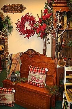
Do like Bellevue Florist and keep distinct styles in separate areas. The Nashville, Tennessee shop is divided into four sections: woodsy Christmas (pictured above), funky Christmas, modern Christmas and traditional Christmas.
It’s time again to deck the halls.
Tempting though it may be to simply hang a wreath or some lights and be done with it, you’ll draw more customers and score more sales if you create thoughtful vignettes, said Gregory Nato, director of visual merchandising and retail presentation at Rebecca Minkoff who has worked as creative director for Macy’s, Montblanc, Polo Ralph Lauren and Victoria’s Secret.
“Consumers are bombarded with visual merchandise,” he said. “You have to decorate if you want to compete.”
Nato partnered with Floral Strategies founder and Floral Management columnist Tim Huckabee last year on webinar titled “Visual Merchandising 101”. Here are a few of his tips to make your displays more impactful this holiday season:
- Show them what they want.
“You want to give customers a mental picture of themselves enjoying your product,” Nato said. “Show them how it will look in their home.”
For example: Flowers on an end table look more irresistible than they do in the cooler. (If the temperature in your shop is an issue, consider a high-quality silk arrangement, dried flowers or hardy products, such as succulents or orchids.) You can really ramp up the desirability factor by positioning the end table next to a sofa, draping the sofa with a cashmere throw, adding a sumptuous lumbar pillow, and hanging some family photos behind it. The customer will see a pretty, peaceful scene that will make them crave the flowers, the blanket, the pillow and the picture frames.
Also, when you decorate your shelves, display a variety of trinkets rather than rows with multiples of the same thing. This better replicates what people do in their own homes.
- Place items for sale nearby.
“Everything they see (that’s available for purchase) should be in close proximity to the vignette,” Nato said. Buckets, baskets or excess vases make handy containers to store candles, ornaments, scarves, mittens, etc. This makes it easy for customers to act on their impulses when they see your appealing displays, without disturbing what you’ve designed.
- Arrange products into categories that make sense.
One piece of this advice involves not mixing styles and patterns. “Simplicity equals elegance,” Nato said.
When Heather McVay of Bellevue Florist in Nashville, Tennessee created her 2015 winter wonderland, she divided the shop’s 1,500-square-foot showroom into four sections to display four very distinct looks: “modern Christmas,” “traditional Christmas,” “funky Christmas” and “woodsy Christmas.” The variety helps her appeal to a broad range of customers; the spacing keeps her displays from looking chaotic and disorderly.
Also consider grouping products that go together, Nato said. Think: stockings next to tiny gifts (stocking stuffers, if you will) such as votive candles, soaps, key chains, lip balms, hand lotions, notebooks, etc. “Customers approach these areas like a buffet,” Nato said. “They shop down the line, picking up this and that.”
- Keep shelves stocked and your checkout area clear.
Is half your spinner or shelf empty? “Restock!” Nato said. “Empty shelves communicate to your customer that you are going out of business.”
Your checkout area, on the other hand, should always be clean and organized. “What if the customer needs to lay down her handbag to dig for a credit card? Or if you need to prepare a package?” Nato said. “Empty space at the checkout area is inviting and keeps everyone from fumbling.”


