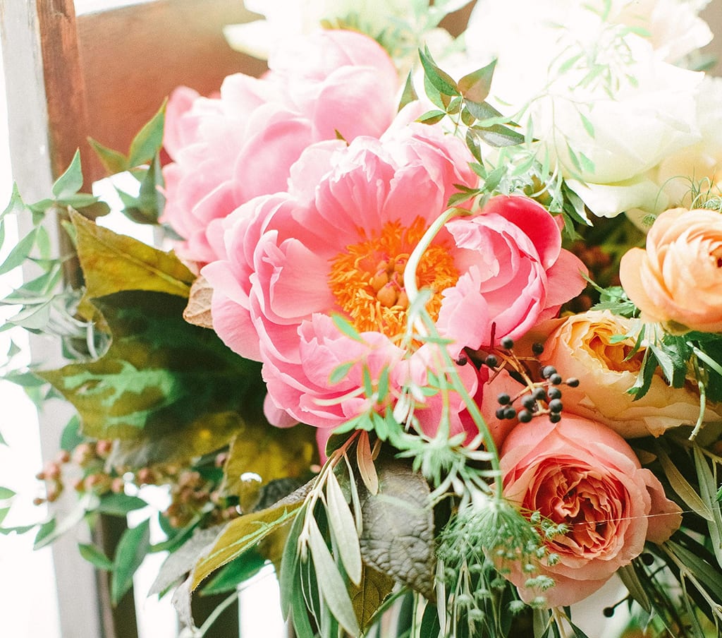
“Living Coral,” the 2019 Pantone Color of the Year, has many florist fans, including Georgia designer Christy Hulsey, who created this bouquet for a recent wedding. “It’s romantic, whimsical, traditional and mood-evoking,” she said. “It fits in all the classic palettes yet provides just a hint of rock ’n roll.” PHOTO BY HALEY SHEFFIELD.
Hallelujah! The Pantone Color Institute has selected its 2019 color of the year and, once again, it’s one with many floral applications.
Last week the venerable design firm unveiled its new pick, “Living Coral” (Pantone 16-1546), to much applause from the floral industry professionals. According to Leatrice Eiseman, the Pantone Color Institute’s executive director, the “sociable and spirited” peachy pink “welcomes and encourages lighthearted activity.” Its name evokes one of the world’s most diverse and colorful ecosystems. “In its glorious — yet unfortunately more elusive — display beneath the sea, this vivifying and effervescent color mesmerizes the eye and mind,” she said.
The energizing color provides warm and nourishment — qualities consumers crave in a rapidly shifting world.
“In reaction to the onslaught of digital technology and social media increasingly embedding into daily life, we are seeking authentic and immersive experiences that enable connection and intimacy,” said Eiseman, who has shared her expertise in the past at Society of American Florists events and in Floral Management magazine. “Representing the fusion of modern life, ‘Living Color’ is a nurturing color that appears in our natural surroundings and, at the same time, displays a lively presence within social media.”
The months-long process of pinpointing a color for 2019 was similar to efforts in years past.
Pantone’s color experts combed the world looking for new color influences. Their research included the entertainment industry, traveling art collections, fashion, all areas of design and popular travel destinations, as well as cultural stimuli, such as new lifestyles and technologies, political events and socio-economic conditions.
The selection resonated with scores of floral professionals, many of whom quickly took to social media to share their excitement.
“Coral is on the floral wish list of my dreams,” said Christy Hulsey, owner of Colonial House of Flowers in Statesboro, Georgia. “I love it! It’s romantic, whimsical, traditional and mood-evoking. It fits in all the classic palettes yet provides just a hint of rock ‘n roll.”
Hulsey also appreciates the long list of flowers available in this bright hue, including peonies, roses, ranunculus, proteas, poppies, dahlias, snapdragons, gerberas and carnations. “Kudos to Pantone for setting us up for a year decked out with the prettiest flowers I’ve ever seen,” she said. “I can’t wait to embrace this color!”
“Living Coral” pleasantly surprised Lake Forest, Illinois florist Eileen Looby Weber, AAF, who expected a continuation of the soft (“Serenity” and “Rose Quartz”) and cool tones (“Ultraviolet,” “Greenery,” and “Radiant Orchid”) that have dominated in recent years. “It’s great to have a warm color finally,” said the manager of Lake Forest Flowers. Like Hulsey, she’s grateful for the plethora of coral-colored blossoms, as well as accents (hypericum berries) and potted plants (azaleas and begonias). She plans to mix the color with whites, greens and blues. “There are so many dynamite combinations you could make,” she said.
Joe Guggia, AIFD, of JP Designs in Santa Maria, California, echoed Weber’s praise for the color’s versatility.
“I’ve been a fan of coral for years,” he said. “Being soft yet vibrant, it blends so well for a variety of looks and styles. It mixes wonderfully with purple, chartreuse, cream, white and hot pink.” While he “doesn’t bow to trends,” he’s very happy with Pantone’s choice and can’t wait to see the industry’s creative take on it.
“The blending of red and orange is truly the best of both worlds,” said Michael Skaff, AAF, AIFD, PFCI, a freelance designer in Savannah, Georgia, and creator of the 2019 Flower Trends Forecast for International Floral Distributors. “When these two shades come together, as they do in the color referred to as ‘Living Coral,’ the result is softer and smoother. It mixes well with so many colors but might be best complemented with a neutral like tan. I love it!”
Fellow trend investigator J Schwanke, AAF, AIFD, PFCI, who will release the uBloom Trend Synthesis in March, anticipated Pantone would promote a cheerful color for 2019. “We’ve had cool tones for a couple years, so it was time for a warm up!” joked the Grand Rapids, Michigan-based designer. He called the color’s moniker “brilliant.” “It connects with society’s interest in conservation, particularly of the oceans, while using a color that doesn’t scream ‘water.’ That’s nice marketing.”
“Living Coral” offers “a vast number of choices” for designers, Schwanke continued. “It looks great with complementary greens and blues — especially aqua — as well as analogous yellows. Think of the ‘Coral Charm’ peony with its golden center. Ooh la la!”
Shelley Pease, AAF, owner of Shelley’s Flowers & Gifts in Waldoboro, Maine, expects to use a lot of coral-colored flowers at her shop this year. “Customers frequently request bright-colored designs,” she said, calling “Living Coral” a “nice twist on millennial pink.”
“Coral has been widely popular in both the wedding and retail side of our business,” said Jeanne Ha, AIFD, of Park Florist in Takoma Park, Maryland. “Of course, I love it, because it is so versatile. Pair peach amaryllis and ‘Juliet’ garden roses with dusty miller for a soft and romantic look. Put it with blue delphinium, thistle and gentiana and it’s exciting and unusual. Or put it with burnt orange ‘Mambo’ spray roses and some bark foliage for a Tuscan feel.”
Ha, too, commended the “Living Coral” name. “I interpret it as a more open color choice — full of lively, vibrant possibilities,” she said.
Katie Hendrick Vincent is the senior contributing editor for the Society of American Florists.


