 Do these headlines sound familiar?
- “She found this cardboard box, but when she rips it open, you’ll be speechless.”
- “When you read these 19 shocking food facts, you’ll never want to eat again.”
“Clickbait” — headlines so over-the-top or filled with breathless suspense — can be annoying but they’re also effective — and all over the web and social media.
In a recent article Entrepreneur, email marketing expert Cynthia Price tackles the question of why some headlines are so impossible to ignore. She taps into human psychology and shares four ways business owners can tweak their calls to action (CTA) to inspire action, which is good, and not annoyance, which is bad:
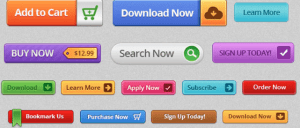
- Use color. Color has a tremendous impact on human emotions: 85 percent of people say color is the main reason they buy a product, Price said. (Who knew hues mattered so much?) “There’s no magic color that converts best, so pick a button color that contrast with your design to make it out,” such as orange on blue or white on black, she said. “Or, use a color that promotes a certain feeling.” Orange, for instance, encourages immediate action, and works well for asking people to sign up, buy or join right away. Similarly, green symbolizes “go,” “which is pretty handy when it comes to CTAs,” Price said.
- Make copy click. To spur someone to take action right away, use copy that is succinct and specific. Think: “download the guide” versus “click here.” Be sure to use strong verbs. “Passive words create lazy mouse-finger couch potatoes, so lead with an active, energetic verb to drive more clicks,” Price said. You might also benefit from using first-person language (“start my free trial” vs. “start your free trial”), she said, citing a recent study that found the tactic produced a 90 percent better conversion rate. And then there’s the age-old trick of adding the word “now,” which works “by creating a bit of extra urgency,” she said.
- Consider shape and size. “Rounded, big, tappable and tested: These four adjectives should describe ever CTA button,” Price said. Rectangular buttons — ideal for fitting copy — are by far the most popular, “but since our brains are programmed to avoid pointy things, make sure to round off the corners,” Price said.
Place CTAs high. Don’t make your CTA buttons compete for attention. Place yours near the top of the screen, as visitors spend almost 80 percent of their time there, “so you’ll catch those folks who are ready to act right away without forcing them to sift through content,” Price said.


