 Click here for a PDF of “LIGHTS! CAMERA! ACTION!“
Notes for Presenting a Stage Program
What goes into the proper presentation for a stage program? How many sleepless nights do you lie in bed and think about what to say or do during your program? How can you present the best program in front of that extremely difficult AIFD audience?
How will you fill that 45 minutes on stage that will be remembered for years to come? It’s a pretty daunting task ahead of you, but one that can be the best learning experience of your life.
After the ideas have been formed, the research has been done, the program has been formulated, the designs have been developed and sketched, the music has been chosen, the power-point has been created, your lists have been written and crossed out as completed, and all that you have left is the actual presentation. And, how hard can that be? After all, you’ve sat in that audience and watched presenters and you know what works well. Just leave it to your wonderful personality and the program will be perfect!
Unfortunately, that is not completely true. After so many hours of hard preparation work, you need that presentation to be the best one that you’ve ever given. How do you go about making that happen?
The program is about floral design and it’s all about educating the audience. There are so many different ways to approach a program presentation, and for better success, we will divide them up into sections:
The Stage
When you first see the blueprint of the stage size and shape, you will also see the backstage ramps and steps for bringing designs on and off the stage as well as the positioning of the stage lights and any other extras that the stage might offer, such as scrims (moving curtains) and pulleys (a device that will raise or lower your design). Usually, the stage will be divided into sections and possibly even more than one level. The blueprint of the stage will look large, but not when it’s filled with designs. Study the blueprint and think of the flow of your program from the audience’s point of view.
The staging blueprint is modified every year depending on the venue configuration. When you study the stage and think of presenting your program, it is easier to look at your program in reverse. What is your finale section or design? Does it have to be preset (placed in position prior to the beginning of the program) or, will it be brought out by stage assistants? As you think of your finale, remember that it will need to be seen clearly by audience even if you have a whole stage full of designs that were already presented during the program. And, there is nothing worse than having a finale that your audience cannot see because the stage is so crowded.
In a nutshell, here are some tips for staging:
- MAKE SURE THE AUDIENCE WILL BE ABLE TO SEE EVERY DESIGN THAT IS BROUGHT ON STAGE.
- START DISPLAYING YOUR DESIGNS AT THE BACK OF THE STAGE AND AS THE PROGRAM PROGRESSES; WORK YOUR WAY FORWARD TO THE FRONT OF THE STAGE.
- SEPARATE THE DESIGNS THAT WILL HAVE TO BE PRE-SET VERSUS THOSE THAT WILL BE BROUGHT OUT DURING THE PROGRAM
- IF A DESIGN IS VERY LARGE AND CUMBERSOME OR HAS TOO MANY
- COMPOSITE PIECES, ALWAYS PRE-SET IT ON STAGE.
- REMEMBER THAT IF DESIGNS ARE PRE-SET ON THE STAGE, THEY WILL BE BLOCKING ANYTHING THAT IS PLACED BEHIND THEM.
- AS A CONSIDERATION, USE THE OUTSIDE CORNERS OF THE STAGE TO PLACE ALL THE PRE-SET DESIGNS IN THE PROGRAM.
- CONSIDER THE FLOW OF DESIGNS COMING ON STAGE – NOT ALL SHOULD BE PRE-SET AND NOT ALL SHOULD BE CARRIED OUT. THAT WILL MAKE FOR A VERY BORING STAGE PRESENTATION.
- REMEMBER ALL DESIGNS PRESENTED ON STAGE DO NOT NEED TO BE
- EXTREMELY LARGE. WITH THE HAND-HELD CAMERA USED ON STAGE, EVEN THE SMALLEST DETAILS OF YOUR DESIGNS WILL BE SHOWN ON THE SCREENS.
- THOUGH BACKSTAGE AREAS MAY BE SOMEWHAT CROWDED, TRY TO HAVE A FEW DESIGNS THAT ARE CARRIED ONTO STAGE FROM STAGE LEFT WHILE MOST OF YOUR DESIGNS ARE COMING OUT FROM STAGE RIGHT. THIS WILL KEEP THE ACTIVITY MORE LIVELY ON STAGE FOR THE AUDIENCE.
Stage Crew
Each Symposium has a Stage Manager and a team of stage assistants. Their job is to make sure that each program gets on and off stage in a timely fashion. Their job is also to help you and your team of stage assistants in making sure that the program runs smoothly. You will be asked to fill out a “Cue Sheet” to help the stage crew know the order of how your program will run on stage. Keep in mind that the main stage crew will be helping every presenter and their stage assistants get every program to run smoothly. It is essential for you that your stage assistants know the routine of your program and all the timing for it. You should have one of your stage assistants be “second in command” to you and it is their responsibility to know what happens during every moment of your program.
- MOST PROGRAMS WILL RUN EFFICIENTLY IF YOU HAVE YOUR OWN CREW OF 5 STAGE ASSISTANTS. ONE OF THEM WILL BE YOUR “SECOND IN COMMAND” AND MUST KNOW YOUR PROGRAM FROM BEGINNING TO END SO THEY CAN ORGANIZE THE REST OF YOUR CREW AS WELL AS THE MAIN STAGE CREW SO THAT EVERYTHING IS PERFECT.
- YOUR “SECOND IN COMMAND” MUST KNOW ALL THE CUES FOR LIGHTING AND SOUND AS WELL AS KNOW WHICH DESIGNS MUST COME OUT IN WHAT ORDER.
- DURING YOUR REHEARSAL, MAKE SURE THAT EVERYONE IS READY TO MAKE THIS HAPPEN. THE PURPOSE OF REHEARSAL IS TO REFINE THE PROGRAM, NOT REINVENT IT. EVERY CHANGE YOU MAKE DURING REHEARSAL IMPACTS LIGHTING, SOUND, STAGE POSITIONING, ETC. IT IS EXTREMELY IMPORTANT TO MAKE SURE EVERYONE INVOLVED IS COMPLETELY AWARE OF ANY CHANGES MADE DURING REHEARSAL.
- TRY TO MAKE ALL YOUR STAGING CUES BE SIMPLE AND UNDERSTANDABLE BOTH FOR YOUR CREW AS WELL AS EVERYONE ELSE BACKSTAGE. IT IS DIFFICULT FOR YOU TO HEAR YOUR MUSIC WHEN ON STAGE DURING YOUR PROGRAM; THEREFORE, IT IS BEST NOT TO RELY ON MUSIC FOR YOUR CUE CHANGES.
PowerPoint
If you are planning to show a power point presentation as part of your program, you will be better served if it is either all shown in the very beginning of the program, or if you segment your program into sections, have each section begin with a part of the power point. If you choose to show the power point in sections, make sure that you create the power point in clearly defined sections. It should be inherently clear to the person running the power point as to where each section begins and ends. Nothing should be left to chance for the most successful program.
- POWER POINT PRESENTATIONS ARE A GREAT WAY TO SET THE MOOD FOR THE ENTIRE PROGRAM OR TO SET THE MOOD FOR EACH SECTION OF THE PROGRAM. REMEMBER THAT THE MORE INVOLVED YOU GET WITH SHOWING THE POWERPOINT IN SECTIONS, THE MORE THE CHANCES ARE THAT THERE COULD BE A MISTAKE.
- WHEN YOU CREATE YOUR POWER POINT, REMEMBER THAT THE MAIN PURPOSE OF IT IS TO BOTH SET THE TONE FOR YOUR PROGRAM, AS WELL AS, BEGIN TO EDUCATE YOUR AUDIENCE ON THE TOPIC YOU ARE PRESENTING.
- AN EFFECTIVE POWER POINT INTRODUCES THE SUBJECT THAT YOU ARE PRESENTING AND SETS THE MOOD FOR THE REST OF THE PROGRAM.
- A GOOD POWER POINT PRESENTATION SHOULD LAST FOR ABOUT 3 TO 4 MINUTES SO THAT YOU KEEP THE AUDIENCES ATTENTION. IT SHOULD TEACH THEM SOME INTRODUCTORY INFORMATION ABOUT THE SUBJECT YOU ARE ABOUT TO PRESENT, OR IT COULD SET THE MOOD FOR THE SUBJECT.
Timing
Your program is set for 45 minutes. It is extremely important to make sure you have 45 minutes worth of program for your audience. Your 45 minutes begins as soon as the announcer introduces you, your sponsor and the name of your program. Time your program in advance, paying attention to the following parts of your presentation. The time division that follows is simply for an example.
- INTRODUCTION (5 MINUTES) – TELL YOUR AUDIENCE WHAT THEY ARE ABOUT TO EXPERIENCE. EXPLAIN THE SECTIONS OF YOUR PROGRAM AND TELL YOUR AUDIENCE WHAT YOU HOPE THEY WILL LEARN DURING EACH SECTION. THIS SHOULD BE CONCISE AND NOT GIVE AWAY TOO MUCH INFORMATION. USE THIS AS A TEASER SO YOUR AUDIENCE WILL BE LOOKING FOR THE KEY POINTS YOU ARE SHARING WITH THEM.
- SECTION I (4 MINUTES) – YOUR POWER POINT PRESENTATION OR VIDEO CLIP WILL GIVE A “LARGER THAN LIFE” VISUAL TO THE AUDIENCE AND REINFORCE THE MOOD OF YOUR PRESENTATION.
- SECTIONS II THROUGH VI (6 MINUTES EACH) – THESE WILL BE THE 5
- SEGMENTS THAT YOU PRESENT YOUR DESIGNS AND EDUCATE YOUR AUDIENCE.
- CLOSING (5 MINUTES) – WRAP UP WITH A STRONG EDUCATIONAL MOMENT THAT REINFORCES WHAT YOU HAVE TAUGHT. THANK YOUR SPONSORS, HELPERS, STAGE HANDS, ETC.
THIS TOTALS 44 MINUTES – DIDN’T THAT TIME PASS QUICKLY?
Music
Music can be a very effective part of your program. It will enhance the mood of the presentation, but only if you choose the music carefully. It will also help keep your audience in the right frame of mind during the program. The best advice is to use your music to introduce or separate sections of your program. For example, if you were going to present a program entitled “The Four seasons” which would be about floral designs for the four seasons of the year, each section could be introduced by the corresponding section of music from Vivaldi’s “The Four Seasons”. After the music serves as an introduction to each section, you would simply begin speaking to the audience. Or, the background music can be the corresponding music being played softly in the background as you work with floral designs from each of the four seasons.
If you choose to use the music as background for your speaking, it’s best to use one selection per section of your program, and just let the stage crew bring each section of music down to silence as you finish each section. Bill Wyatt’s team will control the volume of your music as you speak.
- CHOOSE MUSIC THAT WILL AUGMENT THE STYLE AND CONTENT OF YOUR PROGRAM AND NOT CONFLICT WITH WHAT YOU ARE SPEAKING ABOUT.
- IF YOU ARE GOING TO DIVIDE YOUR SUBJECT MATTER INTO 5 SECTIONS ON STAGE, CHOOSE A MAXIMUM OF 5 DIFFERENT PIECES OF MUSIC. MORE THAN THAT WILL BE CONFUSING.
- REMEMBER TO PROVIDE SOME TYPE OF MUSIC TO BE USED AS THE AUDIENCE IS ENTERING THE THEATER. THIS MUSIC WILL BE PLAYED UNTIL THE PROGRAM IS READY TO BEGIN. TRY TO HAVE THIS MUSIC EXCITE THE AUDIENCE AND SET THE TONE FOR WHAT THEY ARE ABOUT TO EXPERIENCE.
- IF THE THEME OF THE PROGRAM IS SYMPATHY, IT WOULD BE BETTER NOT TO HAVE HEAVY METAL MUSIC PLAYING AS PEOPLE ENTER THE ROOM. THE CONNECTION BETWEEN THE INTRODUCTORY MUSIC AND YOUR SYMPATHY THEME WILL BE HARD FOR YOUR AUDIENCE TO RECONCILE.
- IF YOU WILL HAVE INTRODUCTORY MUSIC AND THEN 5 DIFFERENT
- SELECTIONS TO BE PLAYED DURING YOUR PROGRAM, CREATE A PLAY LIST OF THE 6 SELECTIONS IN ORDER OF HOW THEY WILL BE USED IN THE PROGRAM.
- YOUR MUSIC THAT IS TO BE PLAYED AS PEOPLE ENTER SHOULD BE APPROXIMATELY 10 MINUTES LONG (IT WILL RARELY ALL BE PLAYED, BUT IT IS BETTER TO HAVE MORE MUSIC THAN YOU NEED, SO THE PERSON PLAYING YOUR MUSIC WILL HAVE EXCESS MUSIC TO FADE OUT WITH AND NOT RUN OUT OF MUSIC.) THEN, FOR EACH OF YOUR 5 SECTIONS OF THE PROGRAM, YOU SHOULD HAVE ABOUT 8 MINUTES WORTH OF CONTINUING MUSIC, SO YOU HAVE AT LEAST 2 MINUTES EXTRA IN CASE YOU RUN LONGER WITH ONE SECTION.
- MAKE SURE YOU KNOW WHEN YOU REACH THE 6 MINUTE PORTION OF EACH MUSICAL SELECTION. IF YOU GO OVER IN ONE SECTION, YOU WILL HAVE TO SHORTEN ANOTHER SECTION SO YOU DON’T RUN OVERTIME.
- REMEMBER TO PLAN FOR MUSIC TO BE PLAYED AS THE AUDIENCE EXITS THE AUDITORIUM. THIS MUSIC CAN BE SOMETHING THAT HAS ALREADY BEEN USED BEFORE OR DURING YOUR PROGRAM.
Lighting
Most years, the stage lighting is something that you do not have much control over. When the stage is designed, each section of the stage will have pre-set lighting. As you start planning the placement of your designs, make sure that you are using the lighting to the best advantage of your designs. If you have designs that are darker, try to place them on stage so they are directly under the best lighting. Lighter designs can be placed further away from the stage lights. There will be follow spots that will help brighten each design as you are talking about it on stage.
- STUDY THE FLOOR PLAN OF THE STAGE AND UNDERSTAND THE LIGHTING PATTERN. THE MOST BEAUTIFUL DESIGNS WILL NOT LOOK GOOD IF THEY ARE SHOWN IN DARKNESS.
- DARKER DESIGNS AS WELL AS DESIGNS WITH A LOT OF INTRICATE WORK WILL REQUIRE THE BRIGHTEST LIT PARTS OF THE STAGE.
- DESIGNS WITH BRIGHTER COLORS WILL BE FINE WITH LESS LIGHTING.
- TO GET THE BEST BENEFIT OF THE FOLLOW SPOTS, INCLUDE YOUR PLAN OF TRAVEL ACROSS THE STAGE IN YOUR CUE SHEETS. AS YOU MOVE FROM ONE SECTION OF THE STAGE TO ANOTHER, WALK SLOWLY SO THE FOLLOW SPOT WILL NOT HAVE TO CHASE YOU TO KEEP YOU IN THE LIGHT.
- REMEMBER THAT THE FOLLOW SPOT(S) WILL BE SHINING VERY BRIGHTLY IN YOUR EYES. AS YOU LOOK OUT INTO THE AUDIENCE TO MAKE CONTACT WITH THEM AS YOU ARE SPEAKING, TRY TO LOOK JUST TO THE SIDE OF THE FOLLOW SPOTS SO THAT YOU DON’T BECOME “TEMPORARILY BLINDED” BY THE SPOTS. DON’T LOOK DOWN TO THE GROUND TO AVOID THEM AS THAT WILL MAKE YOU LOOSE CONTACT WITH YOUR AUDIENCE.
Cue Sheet
Correctly completing your cue sheet will probably be the most difficult thing that you will have to do. If possible, you can create your own cue sheet using an Excel worksheet built to match the one that will be given to you. If you are not familiar with Excel work sheets, be sure to make lots of copies of the blank cue sheet you are given as you will find that you will have to keep adding and subtracting things from it. Work in pencil, so you can continually update it.
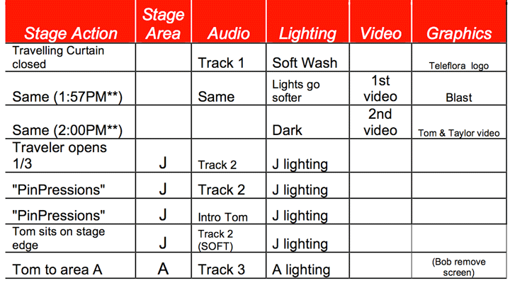
 Most cue sheets will look similar to the sample here. The headers might need some explanation if you have never worked on a cue sheet.
Stage Action – meaning any action that is to happen during the program. In this column, you list anything that must happen with the stage and you also track the presenter’ movements throughout the program. In the sample, the first box under Stage Action has the moving curtain closed before the start of the program. As you follow the column down, the curtain remains closed through 2 short videos and then opens 1/3 of the way on the “J” section of the stage as Tom enters and sits on the edge of the stage as he talks about the design “PinPressions” and then he moves to Area A of the stage.
The second column of this sample cue sheet is Stage Area – here you list which section of the stage the action will take place in. In the first three boxes, the curtain remains closed, so there is no specific area listed. In the 4th box down, the curtain partially opens and the action takes place in the “J” section of the stage. From there, Tom will move to the “A” section of the stage for the presentation of the next design.
The third column of the cue sheet is for Audio cues. For this example program, Tom put multiple tracks of music (for the entire program) on one CD. Separated by track numbers, the backstage audio technician simply has to move from track to track to keep the music going without interruption. In this column, it’s also important to list any changes in the volume that will be needed.
Column 4 is for the Lighting on stage. When you see the blueprint of the stage, it will have the stage divided into sections, labeled alphabetically. Each section of stage will have lights that are able to be dimmed or used at full strength or anywhere in between. As you follow the lighting cues in the sample, the lights on the curtain start soft, then go even softer for the viewing of the first video and then go dark for the second video. As the curtain opens 1/3 of the way, exposing the “J” section of stage, the lights come on in that area of stage. As Tom moves to Area “A” of the stage, the lights will come up there.
The Video column will tell the backstage crew when to show your video. In the example below, the first video (3 minutes long) was shown just before the beginning of the program. Immediately after it played, the second video was played. Both videos were used to excite the audience and introduce the teaching premise of the program.
The final column, Graphics, is used to let the backstage crew know when to have certain graphics visible on the screen. As Teleflora was the underwriter of the program, the Teleflora logo was to appear on the screens on both sides of the stage. The Teleflora logo would then fade as the “Blast” logo appeared. (Blast was the 1st video) The Tom and Taylor video was the next graphic thing that would happen in the program. In the last box under graphics, the cue calls for a screen to be removed from in front of a large design as Tom moves into the “A” area of the stage
- AS YOU CREATE YOUR CUE LIST, IT WILL BE EASIER IF YOU JOT DOWN YOUR MOVEMENT AND PROGRESSION ON THE STAGE.
- AFTER YOU PLOT YOUR JOURNEY THROUGH YOUR PROGRAM, GO BACK TO THE BEGINNING AND START PLOTTING THE AUDIO, LIGHTING, VIDEO AND GRAPHICS.
- AN EASY WAY TO CHECK THE MOVEMENT OF THE PROGRAM ON STAGE IS TO TAKE A SHEET OF CLEAR CELLOPHANE AND PLACE IT ON TOP OF THE DIAGRAM OF THE STAGE. USING A SHARPIE PEN, TRACK YOUR STEPS ACROSS THE STAGE DURING THE PROGRAM.
- FOLLOW YOUR PROGRESS ON CELLOPHANE AND ENSURE THAT THERE IS A GOOD FLOW FOR THE AUDIENCE TO WATCH. AS YOU FOLLOW YOUR PROGRESS THROUGH THE PROGRAM, MAKE SURE THAT YOU ARE NOT CROSSING THE STAGE BACK AND FORTH TOO MANY TIMES.
Program Finale
Here are just a few reminders for the end of your program. Above all, remember to thank your sponsors, because without them we would not be able to present a program. Don’t forget to thank your team of helpers. Many of your helpers have purchased a full registration to Symposium, and have spent most of their time in the workroom with you. Ask them to come on stage and thank them for their help.
- I HOPE THE IDEAS INCLUDED IN THIS PACKET HELP MAKE WORKING ON YOUR PROGRAM EASIER. USE THIS PACKET AS A RESOURCE GUIDE IN HELPING YOU FORMAT THE BEST PROGRAM YOU CAN. YOU MAY FIND OTHER WAYS TO PREPARE, BUT THIS PACKET WAS MEANT TO BE A GENERAL HELP FOR YOU.
- IF YOU NEED NOTES WHEN YOU ARE ON STAGE, PLEASE USE THEM. IT’S NOT A BAD THING TO HAVE NOTES HANDY TO PEEK AT DURING THE PROGRAM. YOU WILL BE NERVOUS, AND JUST A FEW HELPFUL WORDS ON AN INDEX CARD WILL GIVE YOU A BETTER COMFORT LEVEL.
- SPEAK TO YOUR AUDIENCE AS IF YOU KNEW EACH MEMBER OF THE AUDIENCE
- PERSONALLY. LET YOUR PERSONALITY SHINE WHEN YOU ARE ON STAGE.
- BEFORE YOU GO ON STAGE, TAKE A FEW VERY DEEP BREATHS AND RELAX. YOU HAVE WORKED HARD TO PREPARE FOR THIS PROGRAM AND WITH A GOOD FLOW OF PRESENTATION, BEAUTIFUL DESIGNS, EDUCATIONAL TIPS AND A RELAXED MANNER, YOU WILL ACTUALLY ENJOY YOUR TIME ON STAGE.
- IF YOU HAVE ANY ADDITIONAL QUESTIONS, PLEASE FEEL FREE TO CALL THE SYMPOSIUM CHAIR, PROGRAM CHAIR OR MYSELF.


