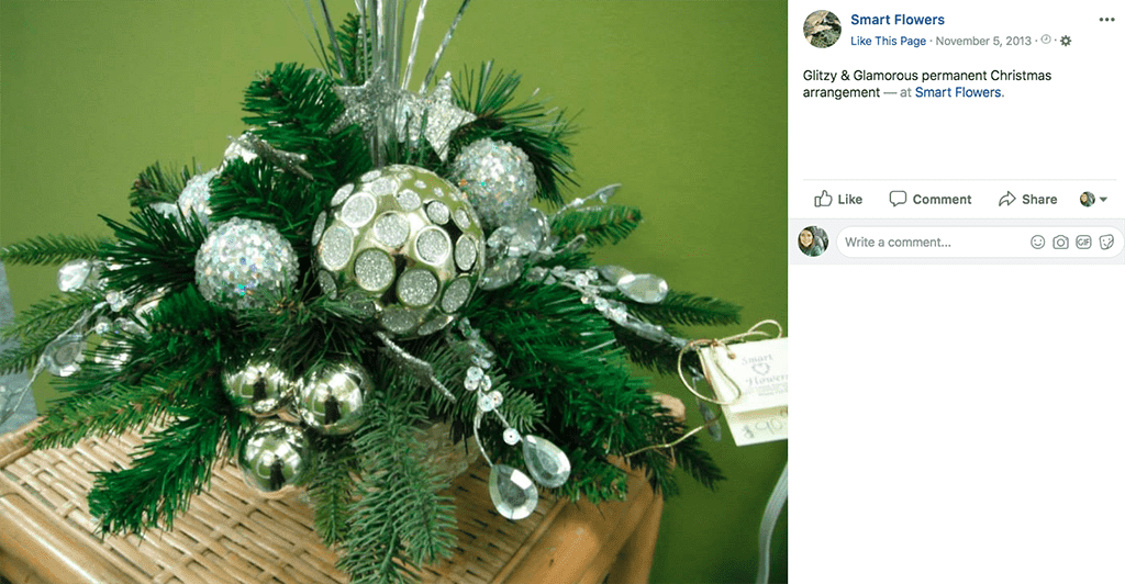
Permanent floral designs, like this centerpiece by SAF member Poppy Parsons, AIFD, CAFA, have great appeal with holiday shoppers who want to reuse decor year after year.
Between customers’ desire to deck the halls and their need to pick up gifts for family, friends, coworkers, etc., there a lot of opportunities to end the year on a high note
In a recent blog post for Smithers-Oasis, floral educator Sharon McGukin, AAF, AIFD, PFCI, author of “Flowers of the Heart” and former president of the American Institute of Floral Designers, outlined a few of design ideas and merchandising techniques to boost holiday sales.
Embrace Faux Flowers
Don’t blanche at silk flowers. Permanent designs have a lot of appeal for holiday shoppers. “Decorations that can be stored and reused are a better investment than disposable designs, especially when they coordinate, making it easy for a novice to decorate,” McGukin said. “Customers often want to keep their holiday decorations from year to year.”
Fresh cut flowers may be your specialty but having a few permanent designs on hand can net you even more sales.
Delight the Senses
“Impulse buying is almost always a result of seeing, hearing, touching, smelling or tasting items in the store while the consumer is in shopping mode,” McGukin said. Building vignettes that feature color, texture, fragrance and “a sprinkle of sparkle” will set you apart from the competition. (Festive tunes also don’t hurt. Click here for advice on the most loved — and most loathed — songs.)
Create Companion Pieces
Don’t settle for selling one design; aim for two, three, four or five! Holiday customers are typically looking for the following looks: a wreath for the front door, a centerpiece for the dining table, a decoration for the mantle, something for the kitchen or an accessory for an accent area such as a sofa or foyer table.
“One way to turn these holiday shoppers into satisfied customers is to create companion pieces of all five design styles for each vignette, theme or color collection in your displays,” McGukin said. “Create small vignettes that offer ideas on how to use the new products along with items they already have at home. Cross-market products that can be used together.”
Set Up Your Store the “Right” Way
Roughly 90 percent of people are right-handed, and instinctually, that’s the direction they turn when they enter a room.
McGukin recommends your “most interesting space” along your right-hand wall. “Place your most up-and-coming items to the right of this display space,” she said. “Then turn to the left to build the next display for counterbalance.”
On the left side of the room, place a “grab and go” area for impulse items. (This is also a smart location for your sales counter and register.)
Have a “Point”
Without a focal point, a display “can be confusing, overwhelming or even just plain boring,” McGukin said. “Select the message you want to communicate and back it up with a concentrated use of a primary product supported by complementary items.”
Avoid “Butt Brush”
Ever tried shopping in a crowded shop? Claustrophobic spaces aren’t inviting. McGukin cites Paco Underhill, author of “Why We Buy: The Science of Shopping,” who says the fear of “butt brush” (bumping into merchandise from behind) persuades some shoppers to skip whole areas of stores.
Click here to read McGukin’s full blog post.


